
Case Study
Redavfined Aesthetics
Brand Identity, Creative Direction & Environmental Branding for a Wichita aesthetics and wellness practice built around calm, confidence, luxury, and trust.
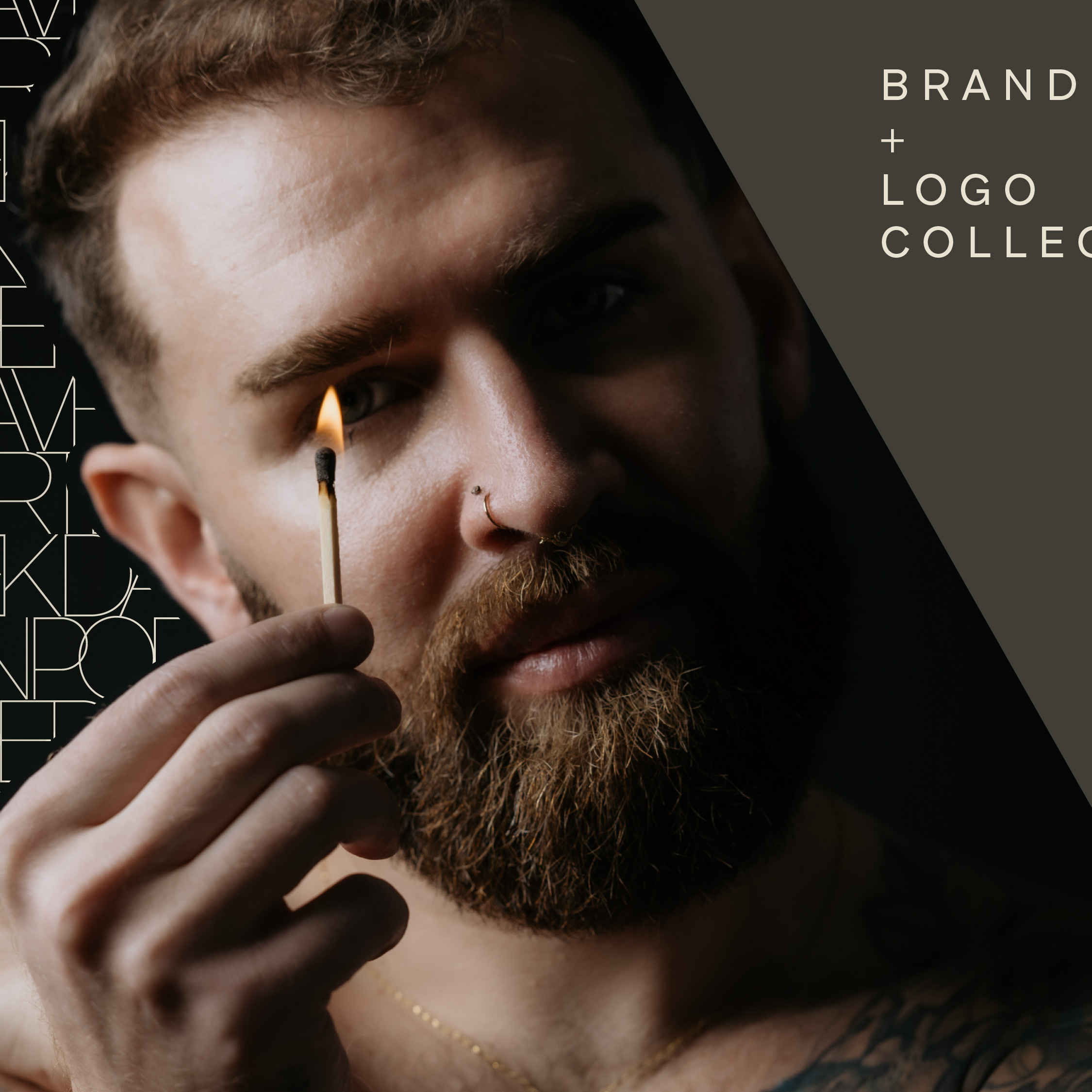
Project Overview
I build brands that become complete experiences.
Redavfined Aesthetics is a Wichita-based aesthetics and wellness practice built around advanced medical treatments, holistic healing, and personalized client care.
Working closely with owner Derek Davenport, I developed a complete brand strategy and visual identity designed to communicate calm, confidence, luxury, and trust. The final system moved beyond a logo into guidelines, social media, print collateral, apparel, signage, and the physical experience of the space.
The Challenge
A brand built on balance.
The aesthetics industry often leans on predictable visual language: soft scripts, facial silhouettes, and generic spa cues. Redavfined needed to feel elevated and professional while avoiding those familiar patterns.
The challenge was balancing medical expertise, holistic wellness, luxury, personal connection, natural elements, and inclusive appeal in one cohesive identity.
Brand Essence
- Calm
- Moody
- Soothing
- Luxurious
- Inviting
The final direction is intentionally slightly masculine while remaining simple, inclusive, and restorative.
The Goal
Create an identity that feels like a retreat - warm, calming, and grounded - while still communicating expertise, confidence, and long-term trust.
The Direction
Move away from surface-level beauty cues and toward a complete experience rooted in transformation, wellness, confidence, and care.
Logo System
A mark that connects.
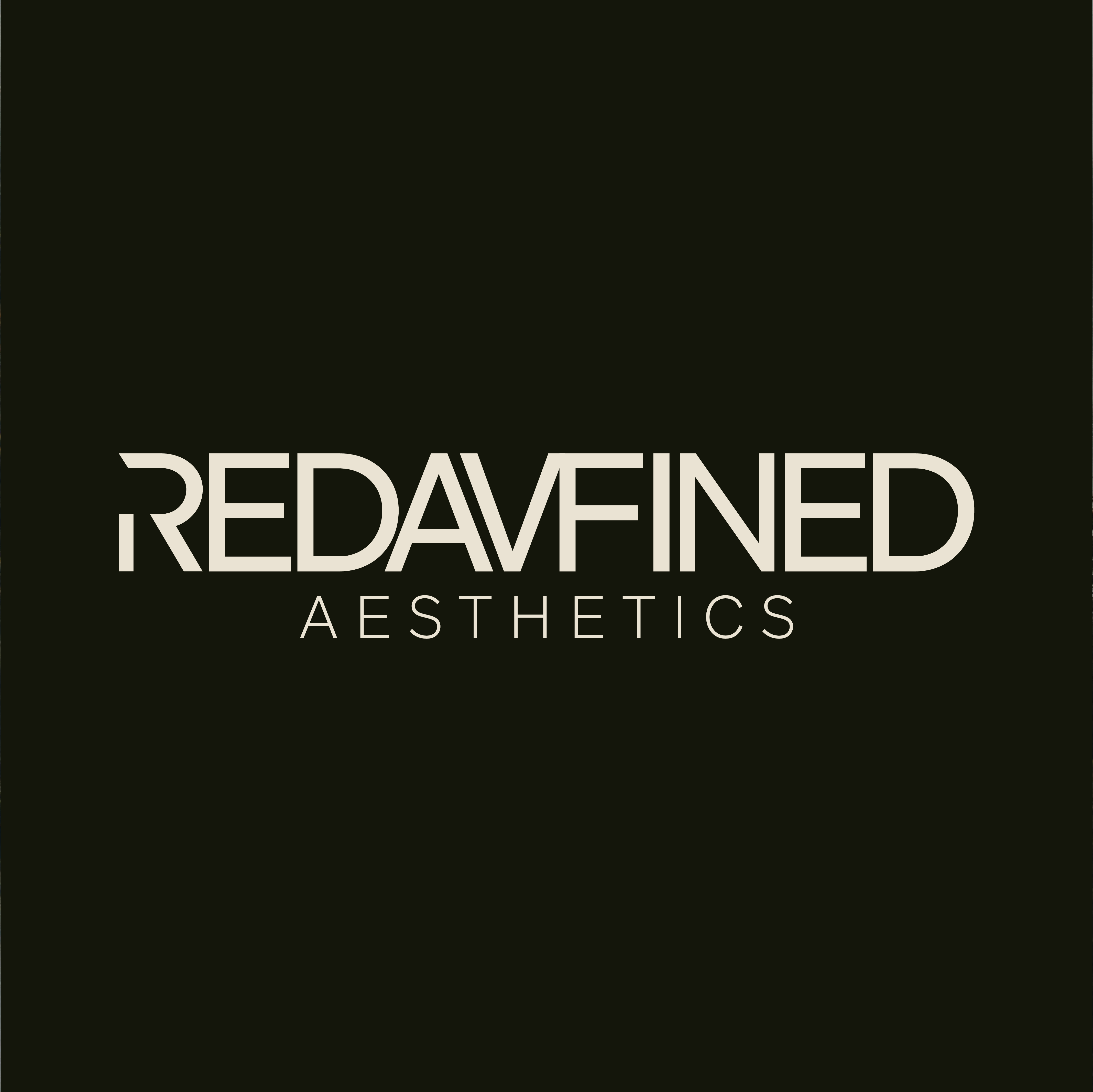
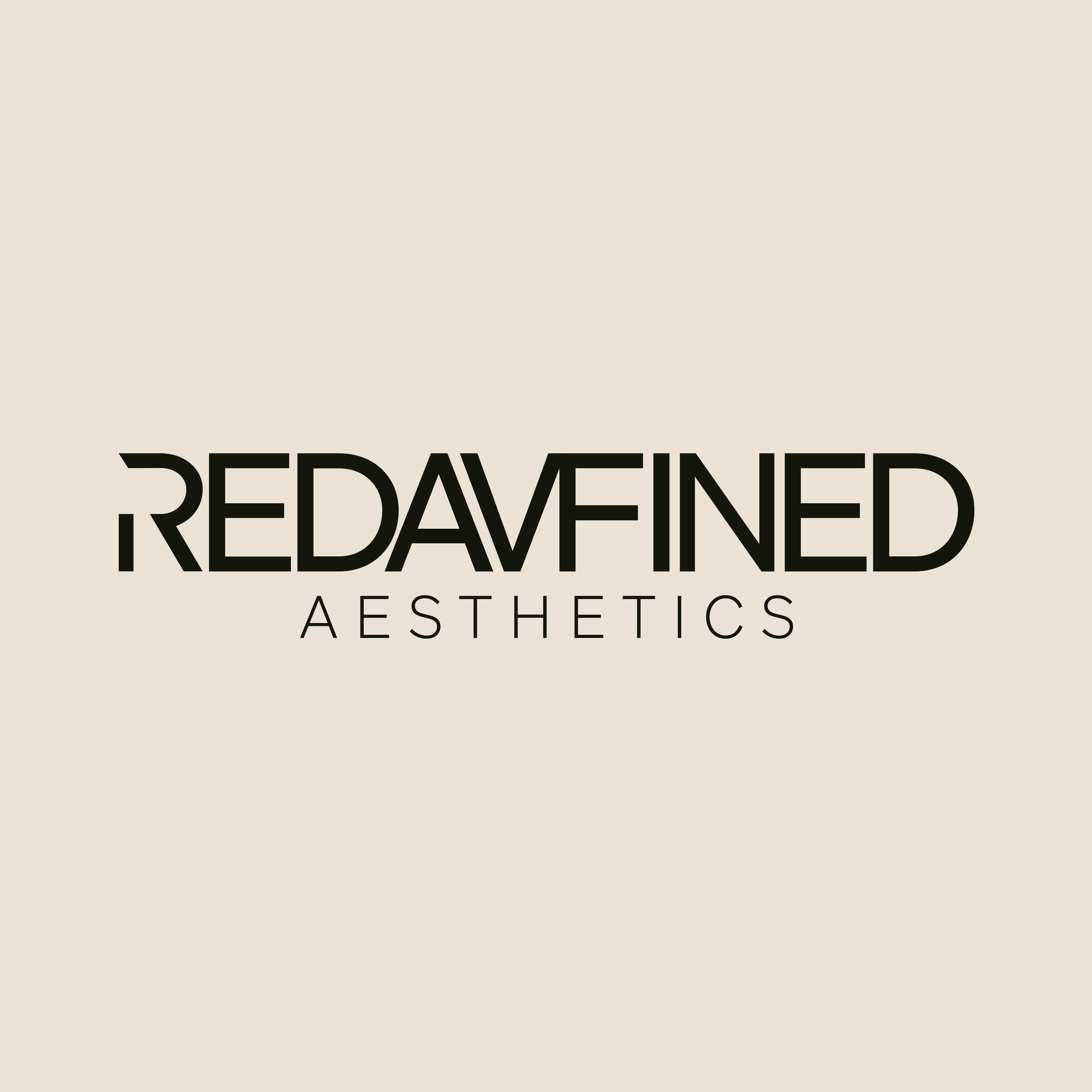
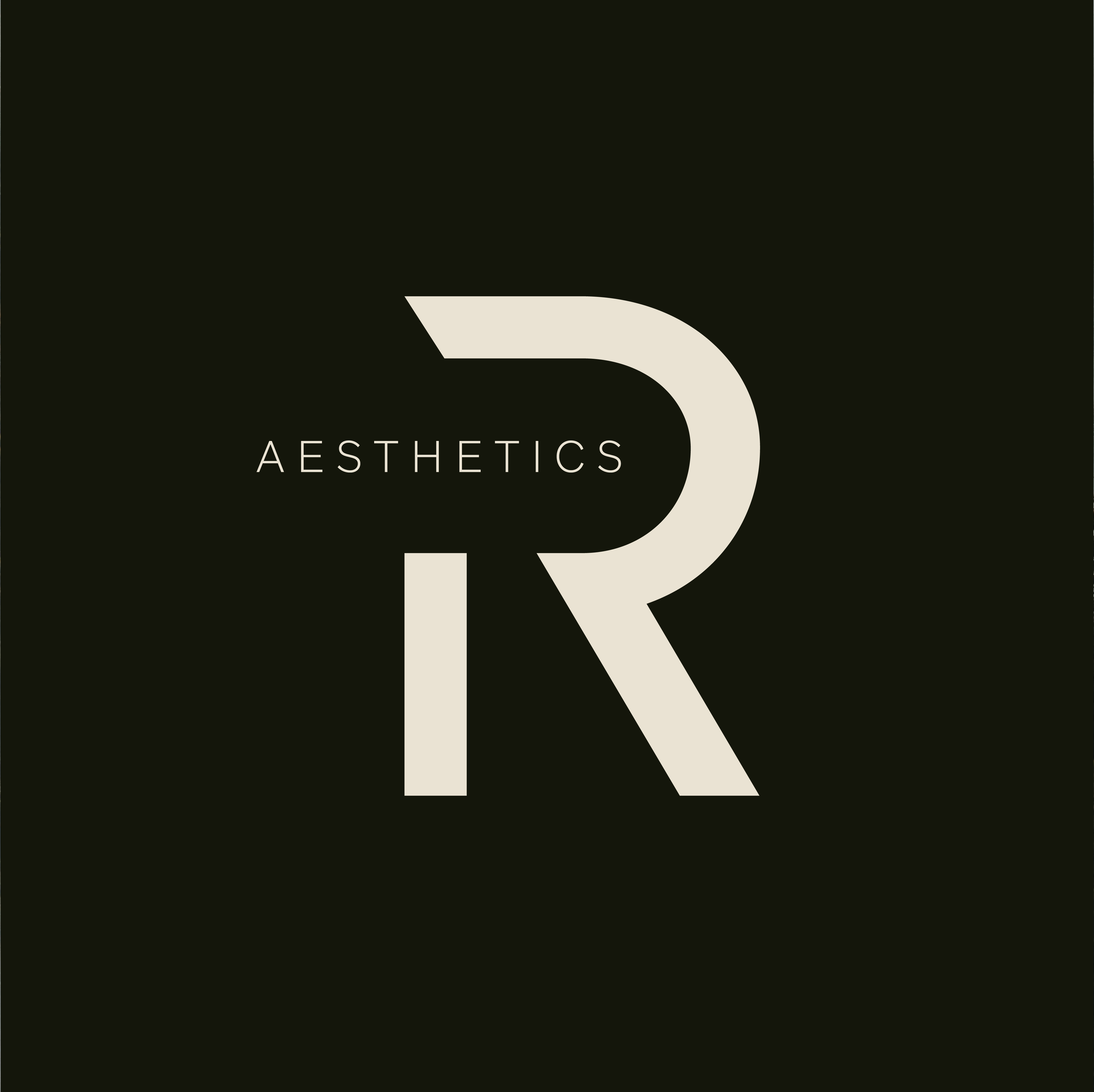
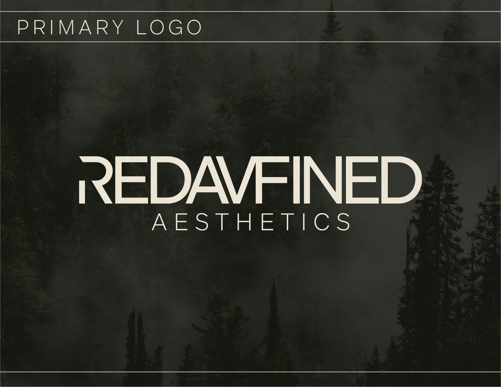
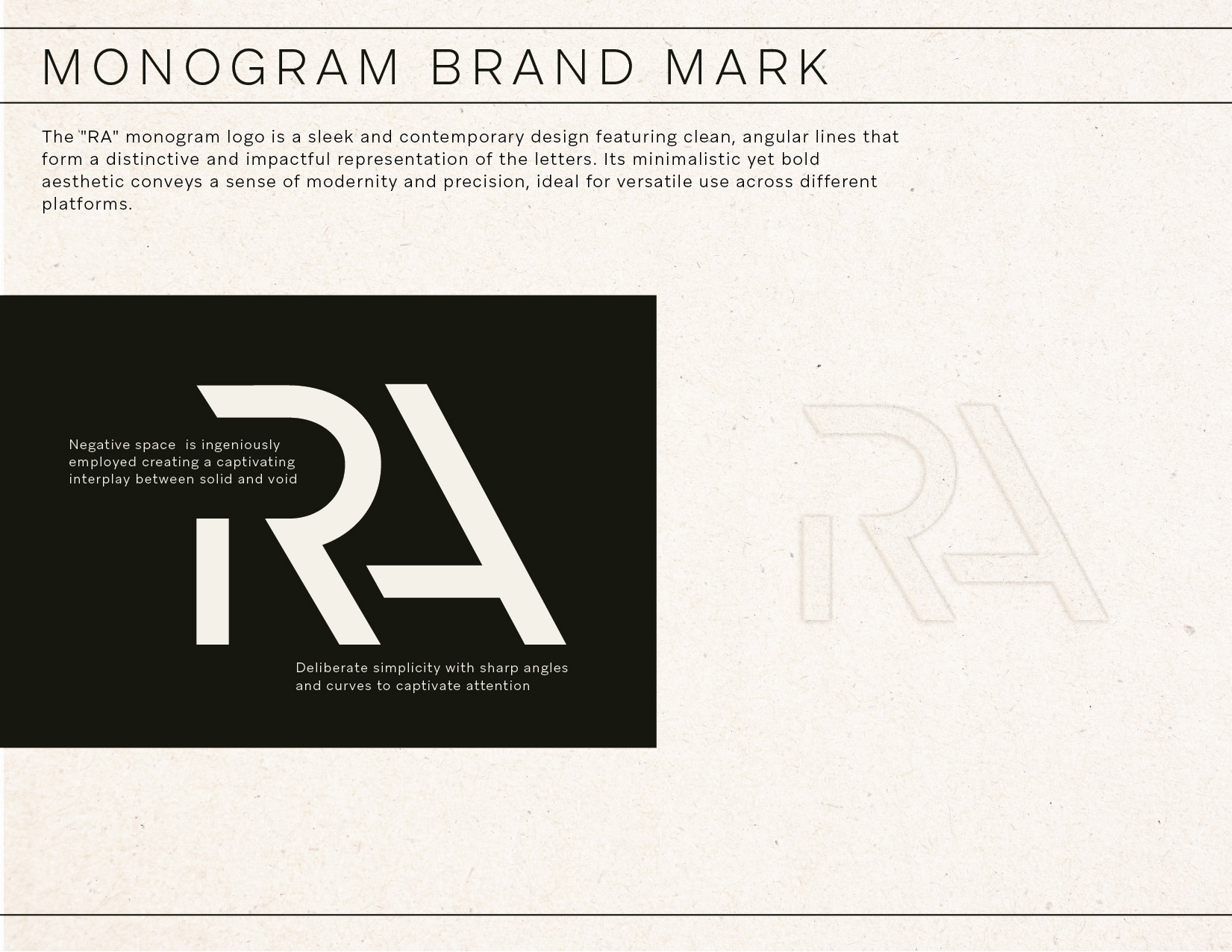
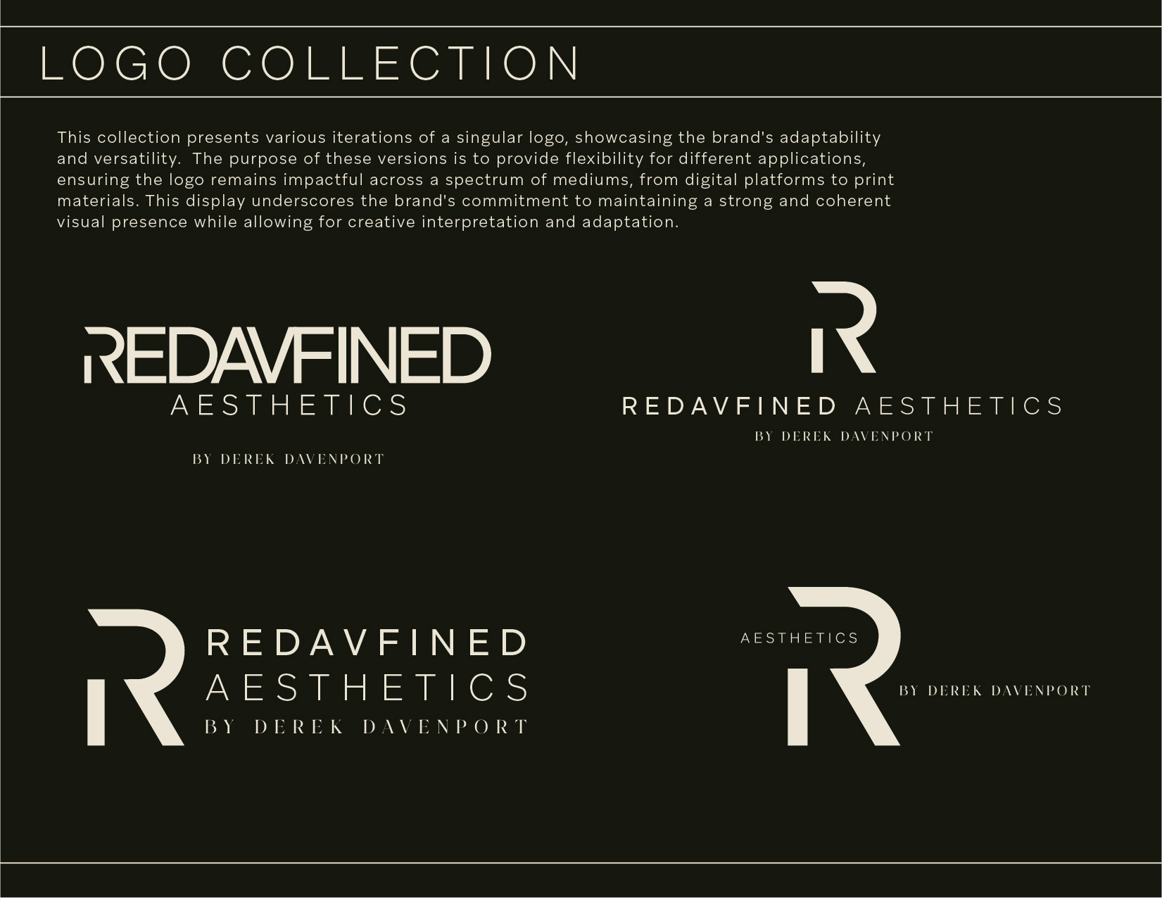
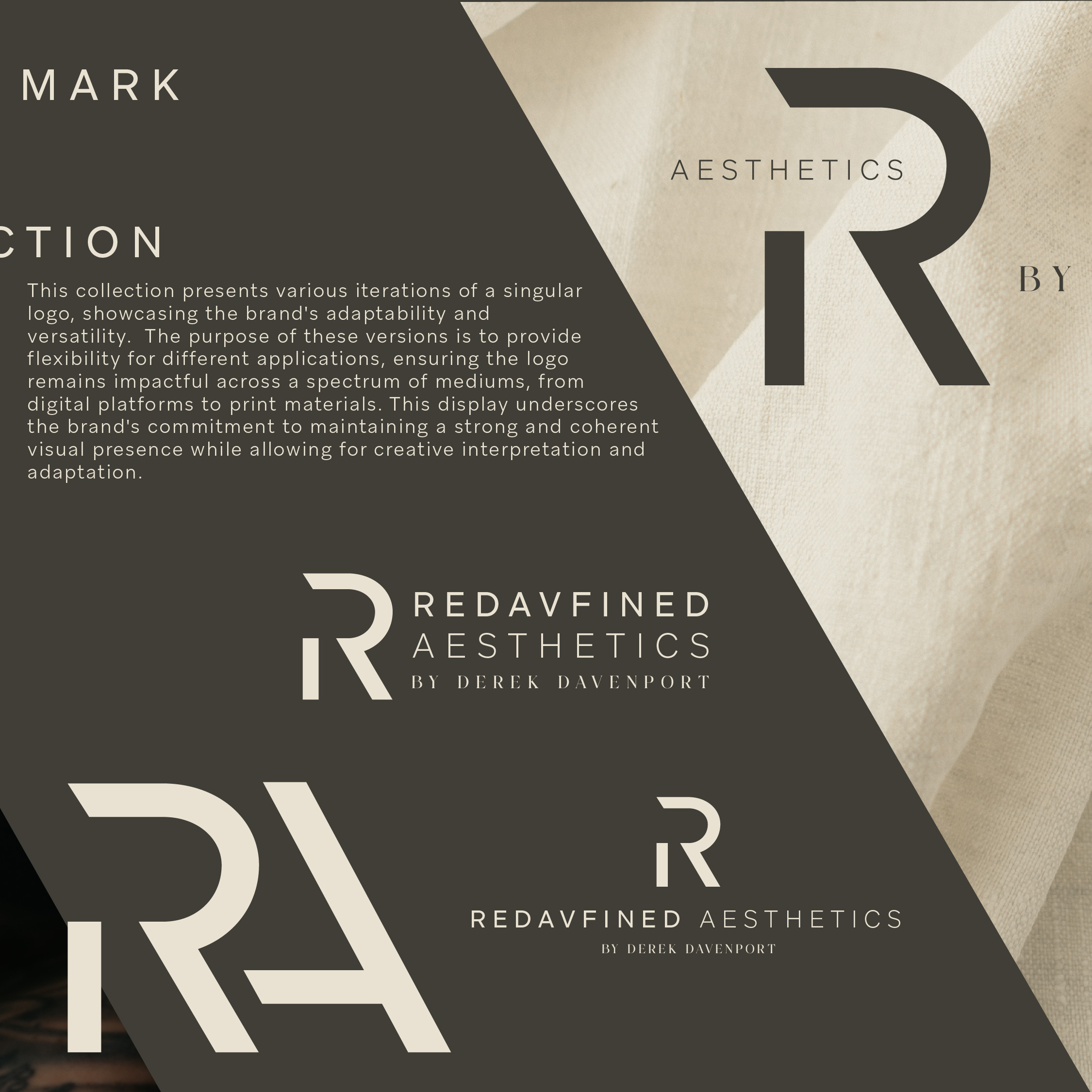
The Redavfined monogram combines partial forms of the letters R and A. The broken pieces come together as one recognizable symbol, reflecting the way different treatments and forms of care create a complete client experience.
Visual Identity
A cohesive system.
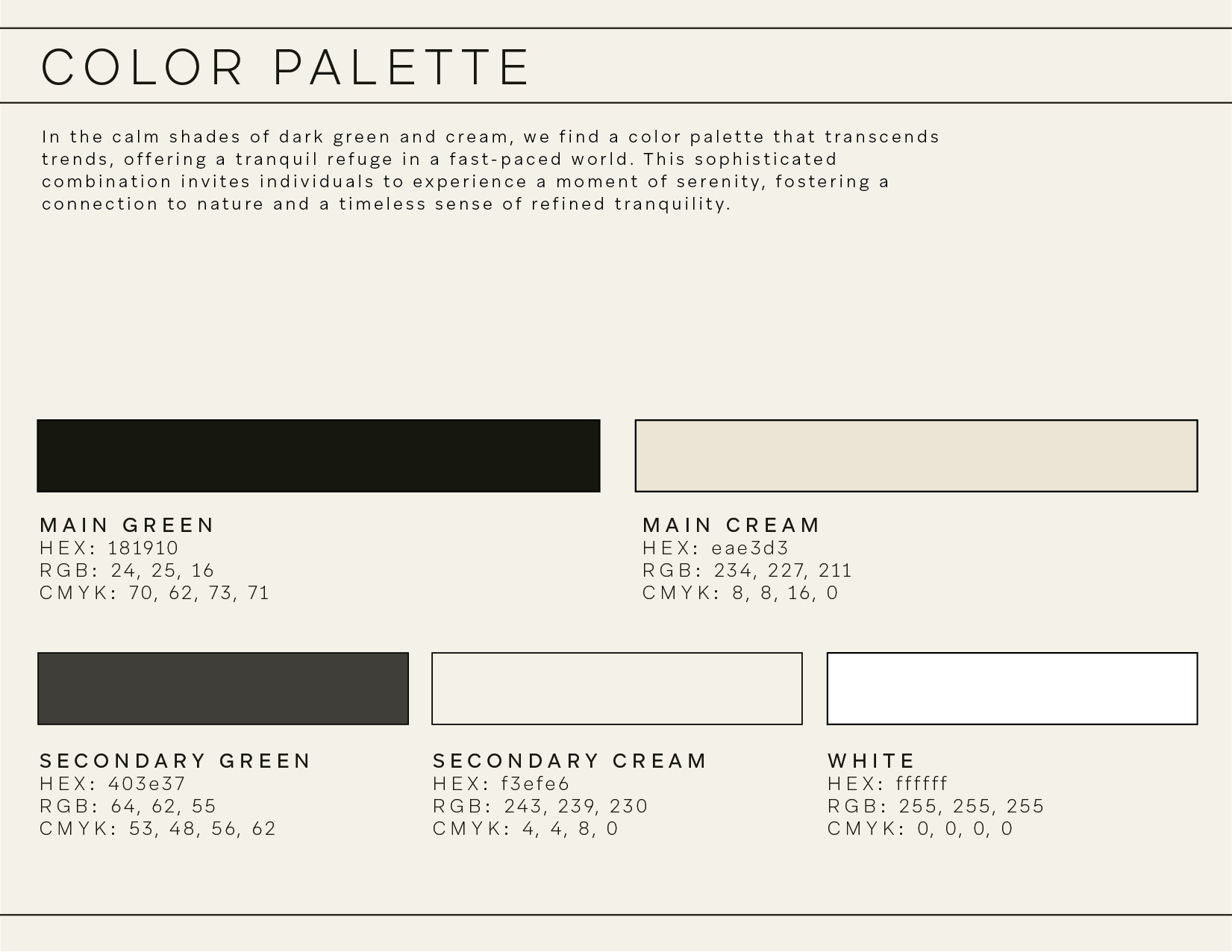
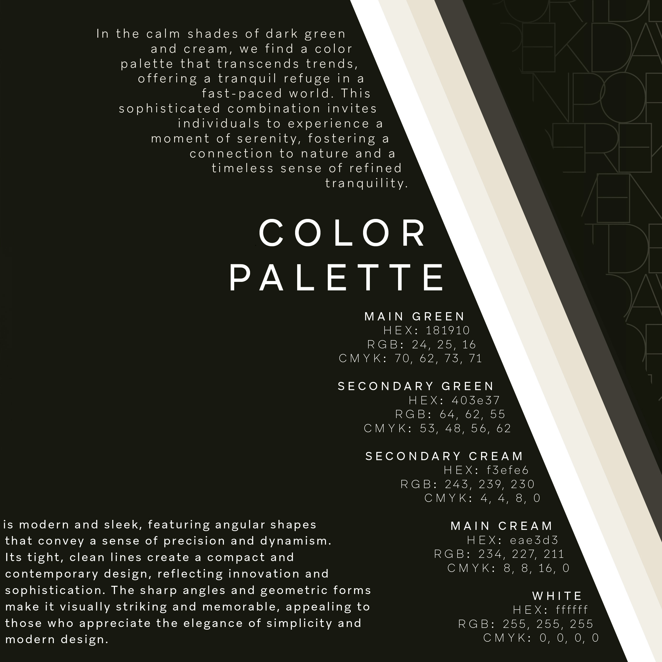
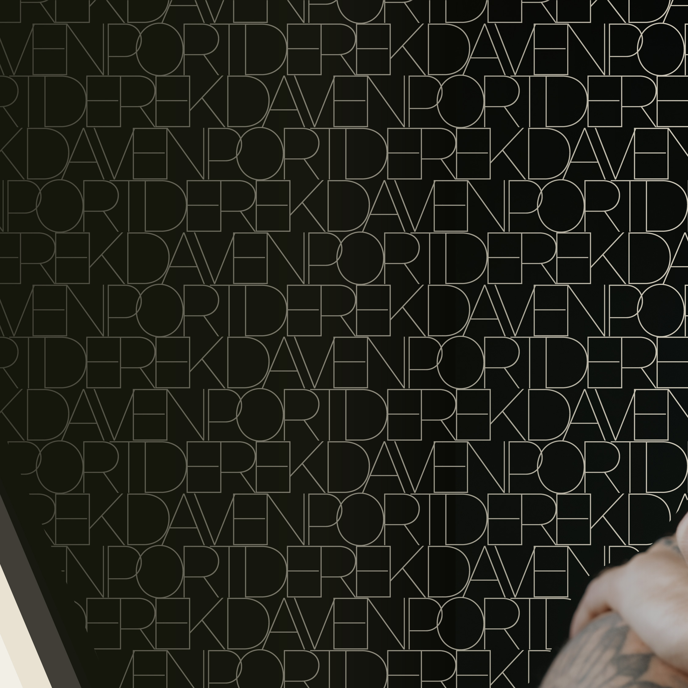
Deep green, warm cream, refined typography, and a custom pattern system create a brand language that feels grounded, premium, calm, and comfortable.
Color Palette
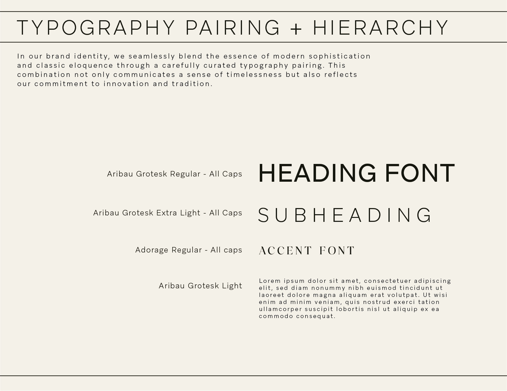
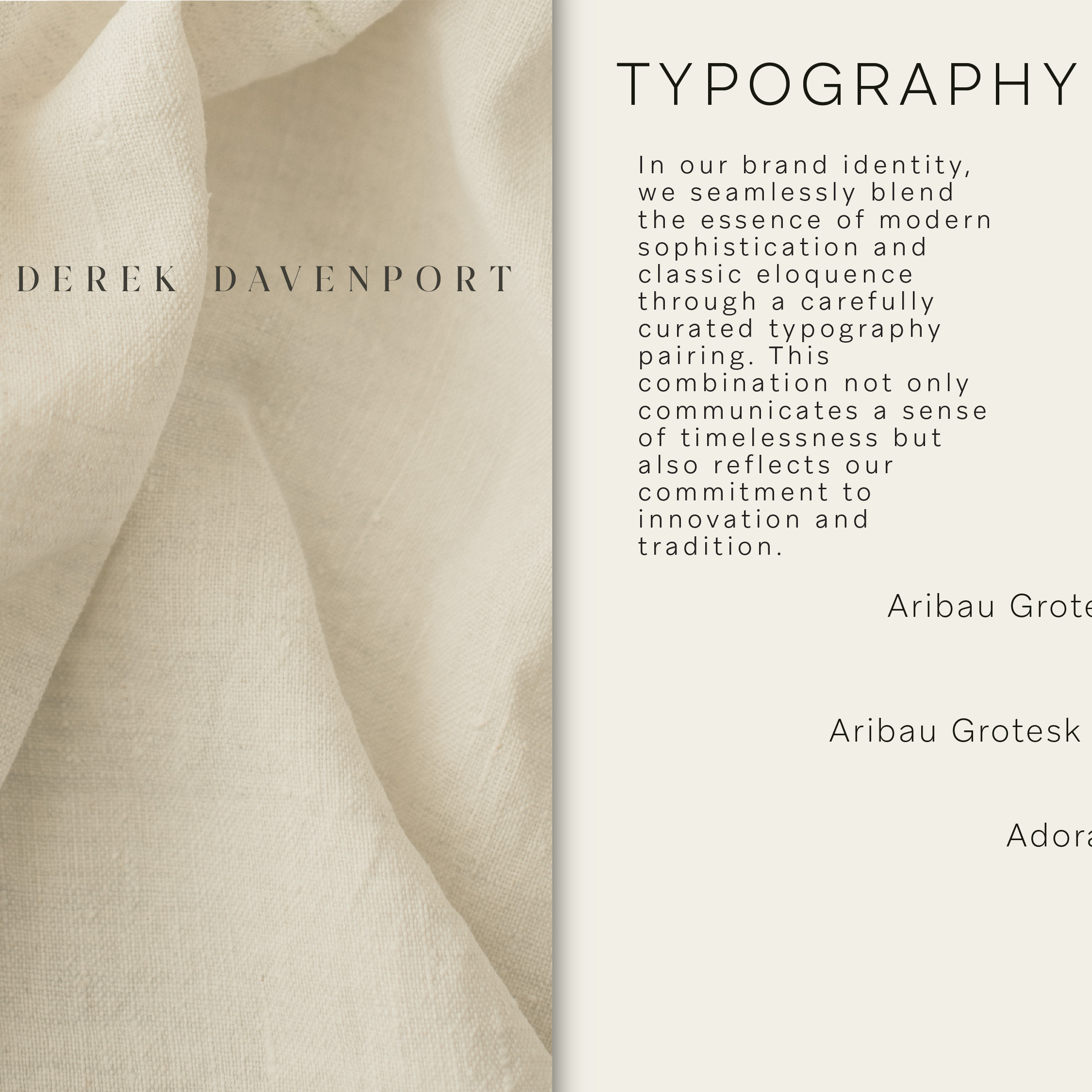
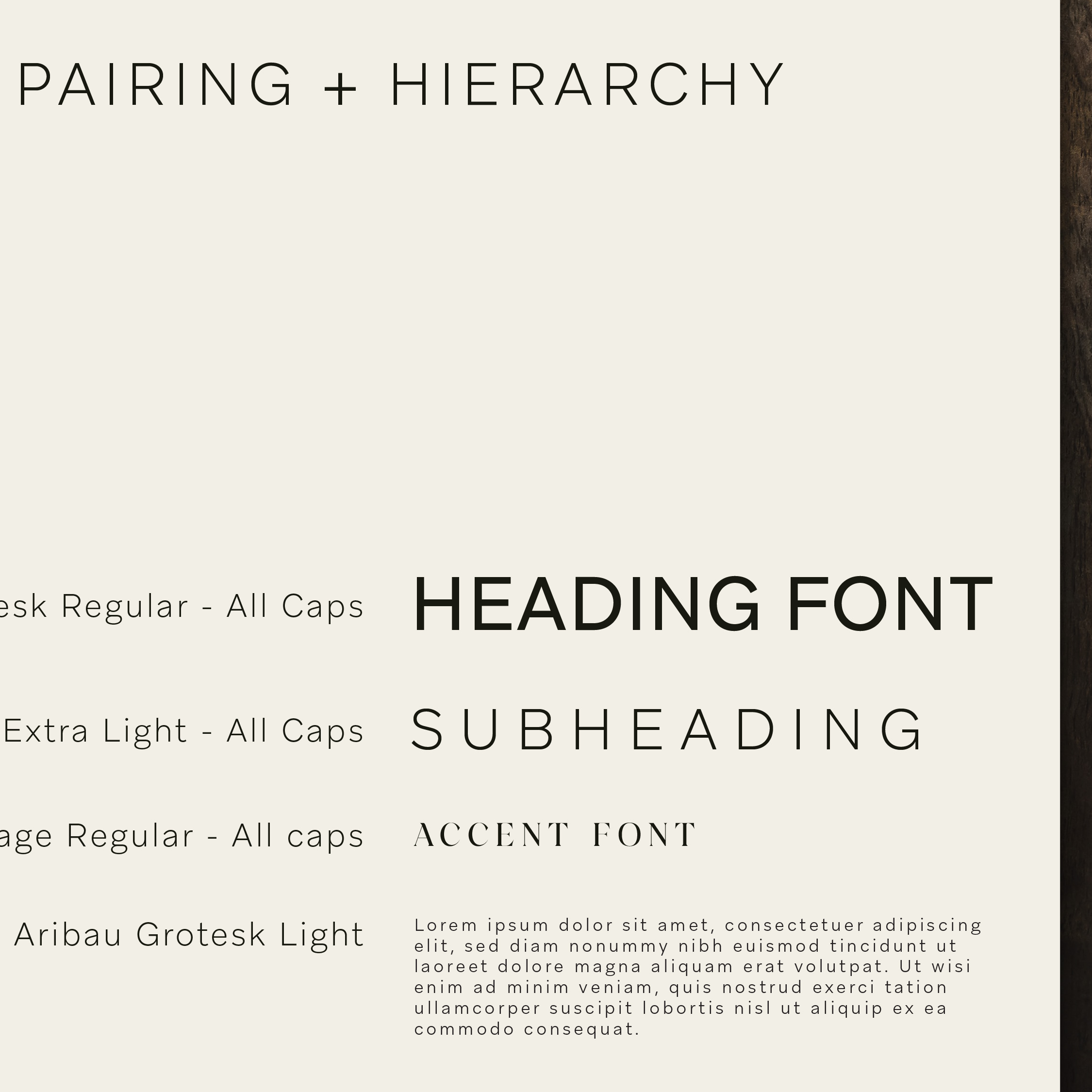
Typography
Aribau Grotesk
Modern, clean, minimal, and highly readable.
Adorage Regular
Added as a refined accent for personality and contrast.
Brand Guide Showcase
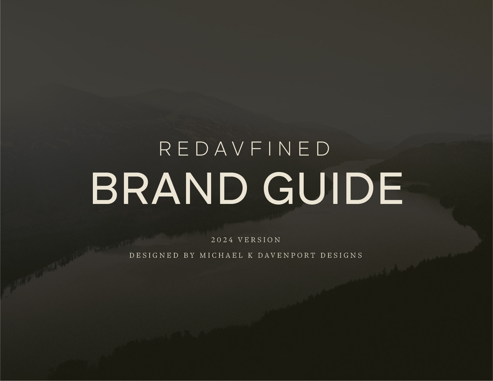
The system, documented.
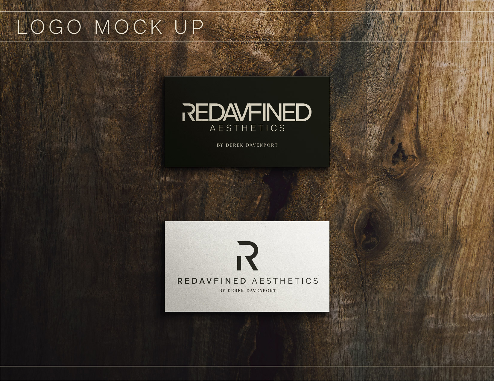
The guide gave Redavfined a practical foundation for keeping future digital, print, and environmental applications consistent.
Social System
Swipe-ready brand storytelling.
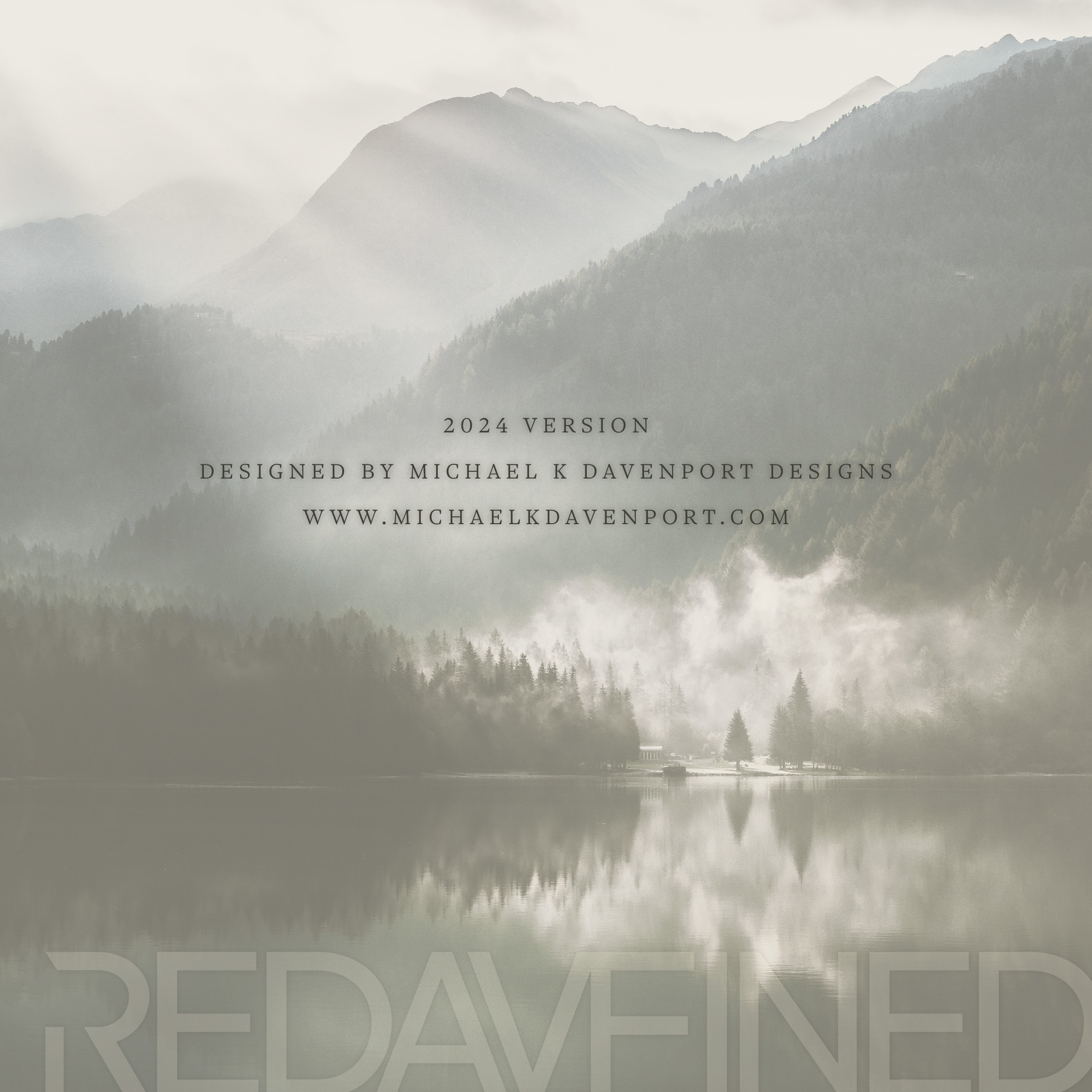
A carousel-style social set translated the identity into a digital format that could introduce the brand, explain the system, and establish atmosphere.

Applications
From identity to environment.
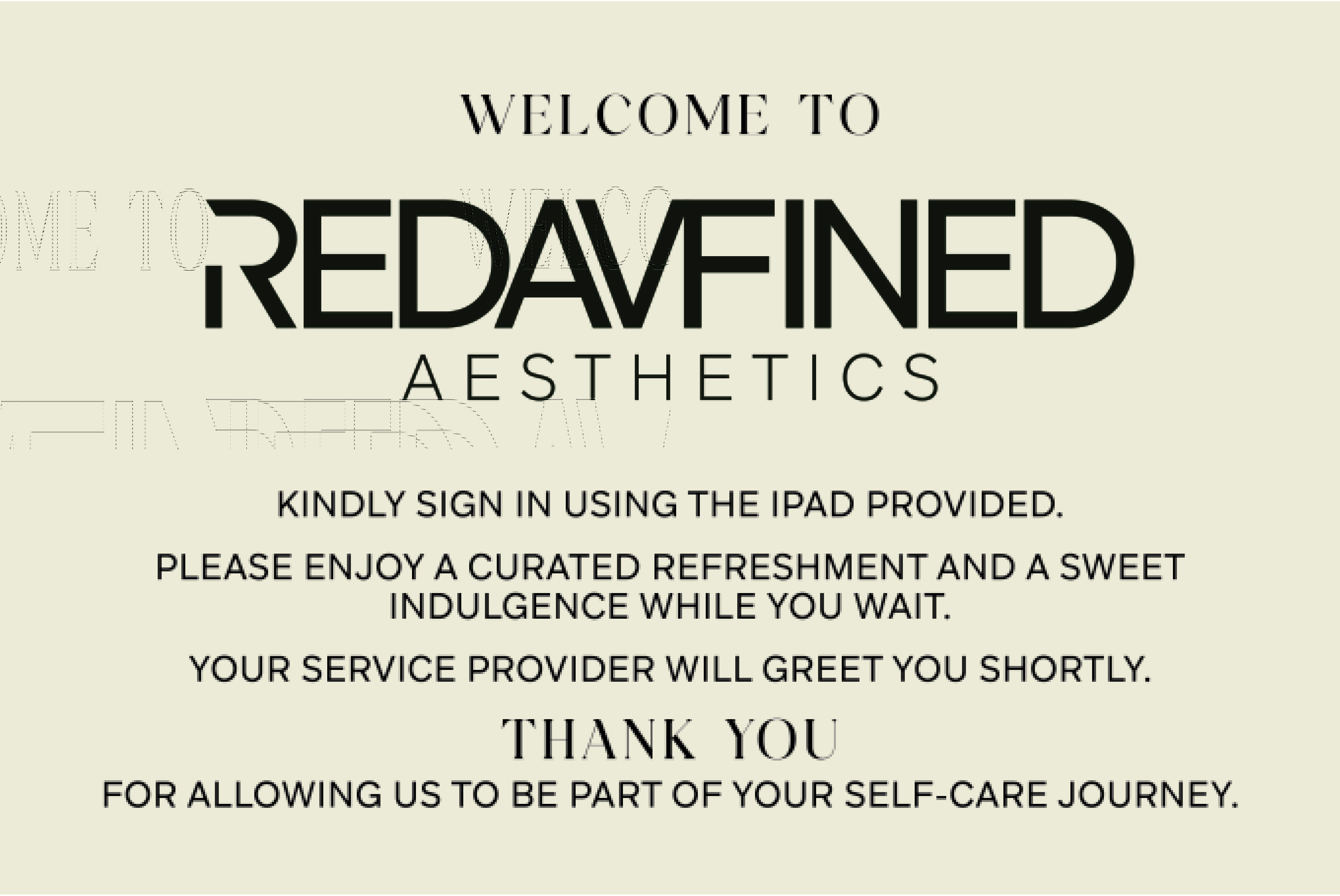
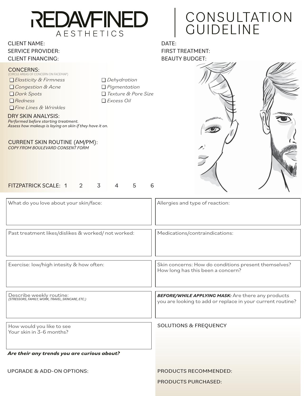
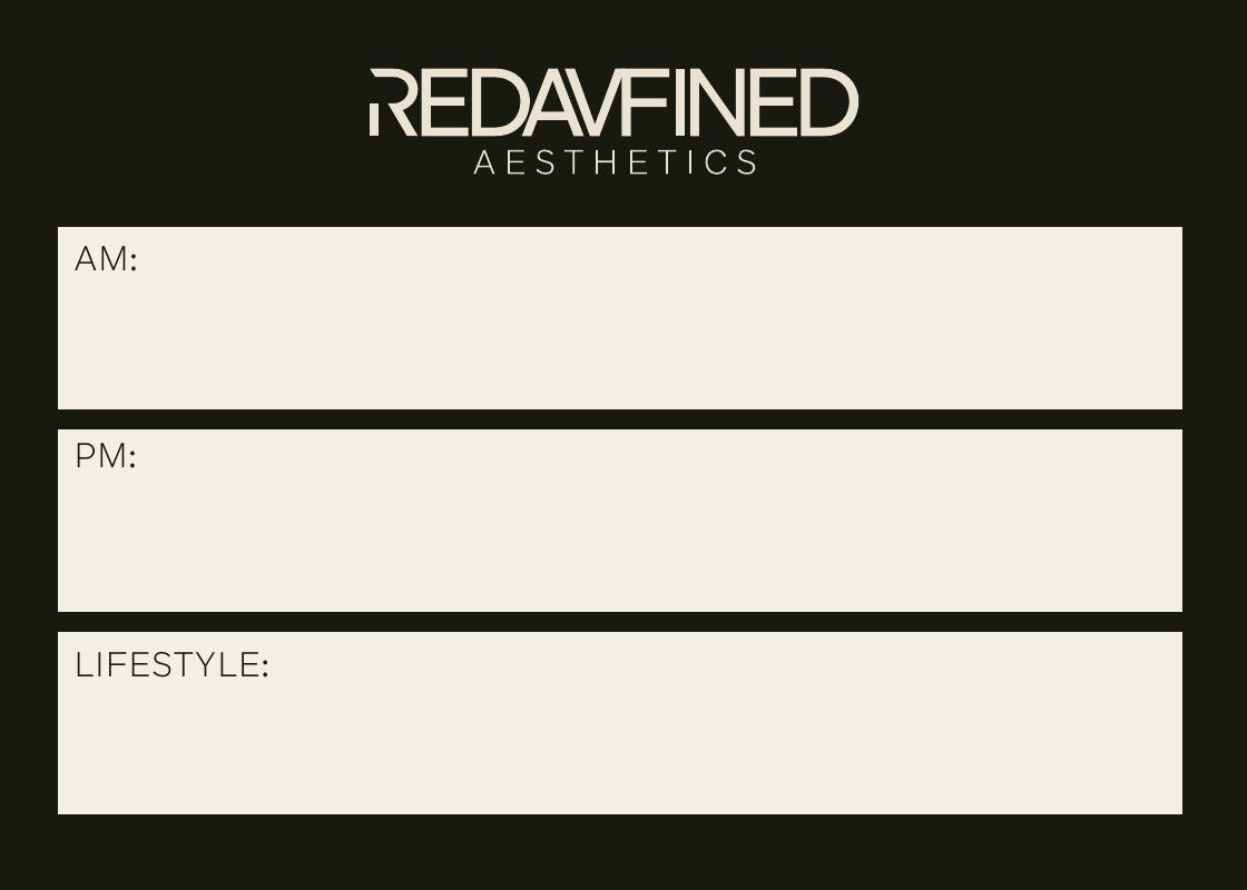
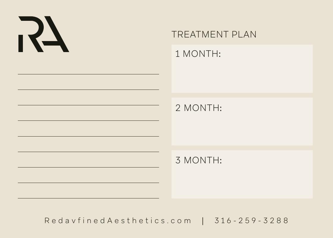
The most rewarding part of this project was watching the visual system move beyond digital files and become a complete experience across check-in, consultation, aftercare, signage, apparel, and the spa environment.
Results
An identity that continues to grow with the business.
- The logo, color palette, and typography remain the foundation of the brand today.
- The system works across digital, print, apparel, signage, and physical space.
- The project developed into an ongoing creative partnership.
- Clients continue to compliment how well the space reflects the identity.
The branding feels completely like me.
Derek Davenport, Owner of Redavfined Aesthetics
Ready for your next project?
Let us build a brand that feels complete.
Strategic identity, print, packaging, digital design, and real-world brand systems.