Calm, moody, restorative.
A dark green and cream identity built around atmosphere, trust, and the client experience.

Case Study
Packaging design, product identity, photography direction, and campaign strategy for a skincare system built to bring professional care into daily routines.
Project Overview
Following the launch of Redavfined Aesthetics, Derek Davenport recognized a disconnect many estheticians experience. Clients invest in professional treatments, but often struggle to maintain those results once they return home.
Prime Theory Skincare was created to fill that gap. Rather than simply designing product labels, I worked with Derek to build a complete product experience that complements Redavfined while introducing an energetic, colorful system that feels approachable, memorable, and easy to navigate.
There was a gap between what happens in a professional setting and what happens on someone's bathroom counter.
Derek Davenport
The Challenge
The work needed to extend the professional spa experience into clients' homes while making skincare feel optimistic, approachable, and easy to understand.
Strategy
The contrast became the strategy. Clients experience calm during treatment, then leave with products that feel vibrant, optimistic, and impossible to confuse.
A dark green and cream identity built around atmosphere, trust, and the client experience.
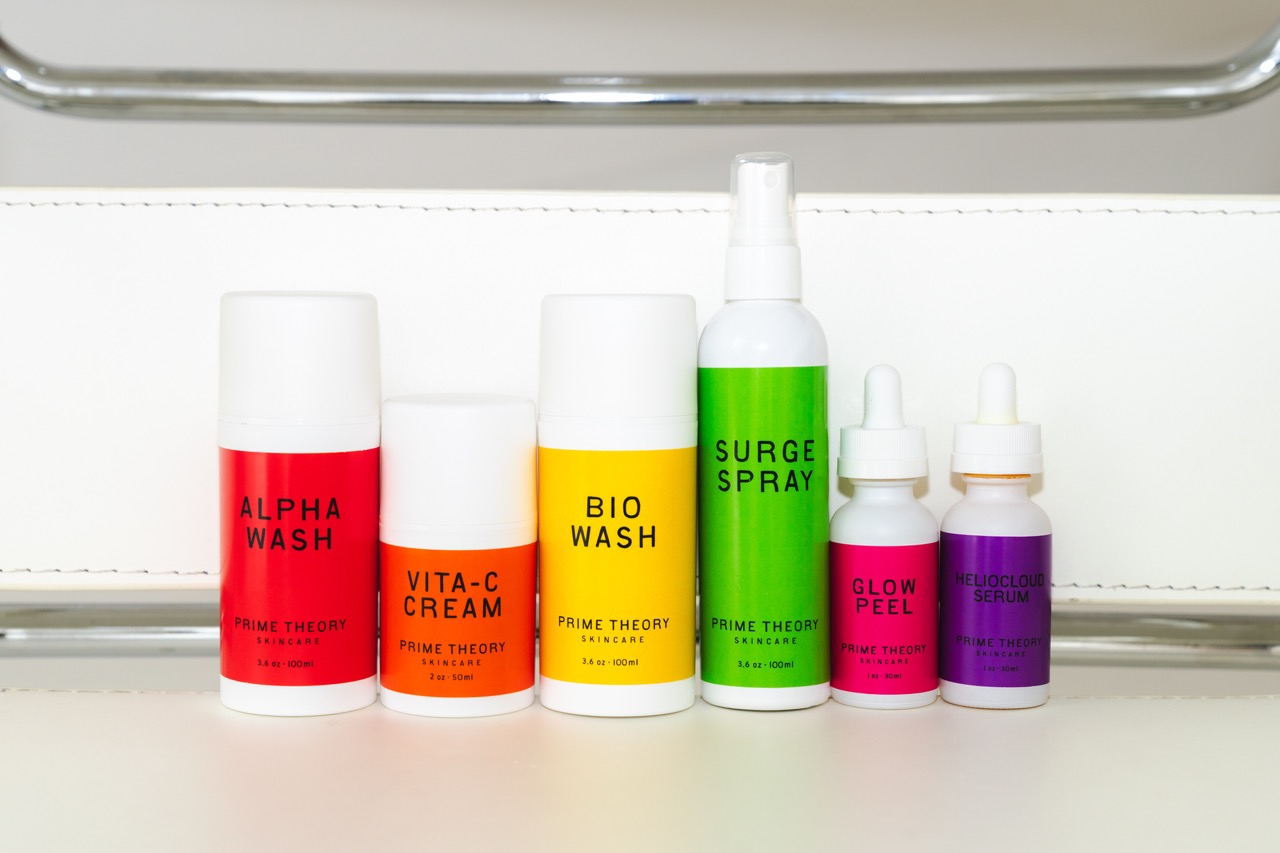
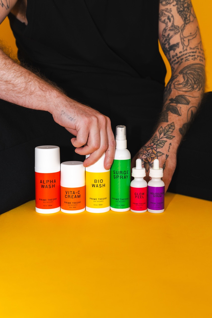
A colorful product system built around routine, education, and immediate recognition.
The Product Personalities
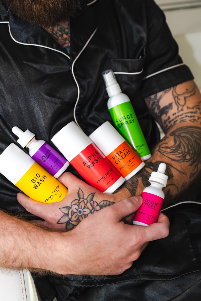
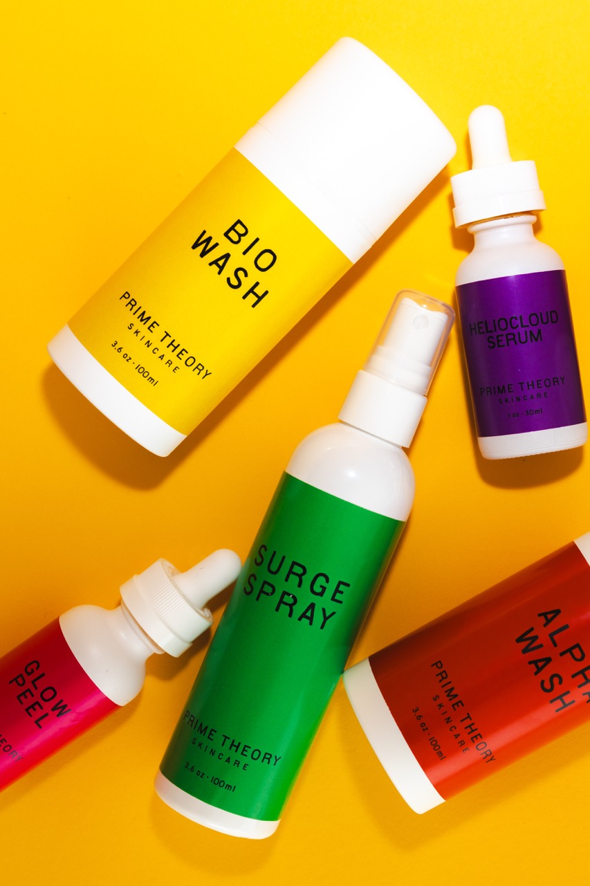
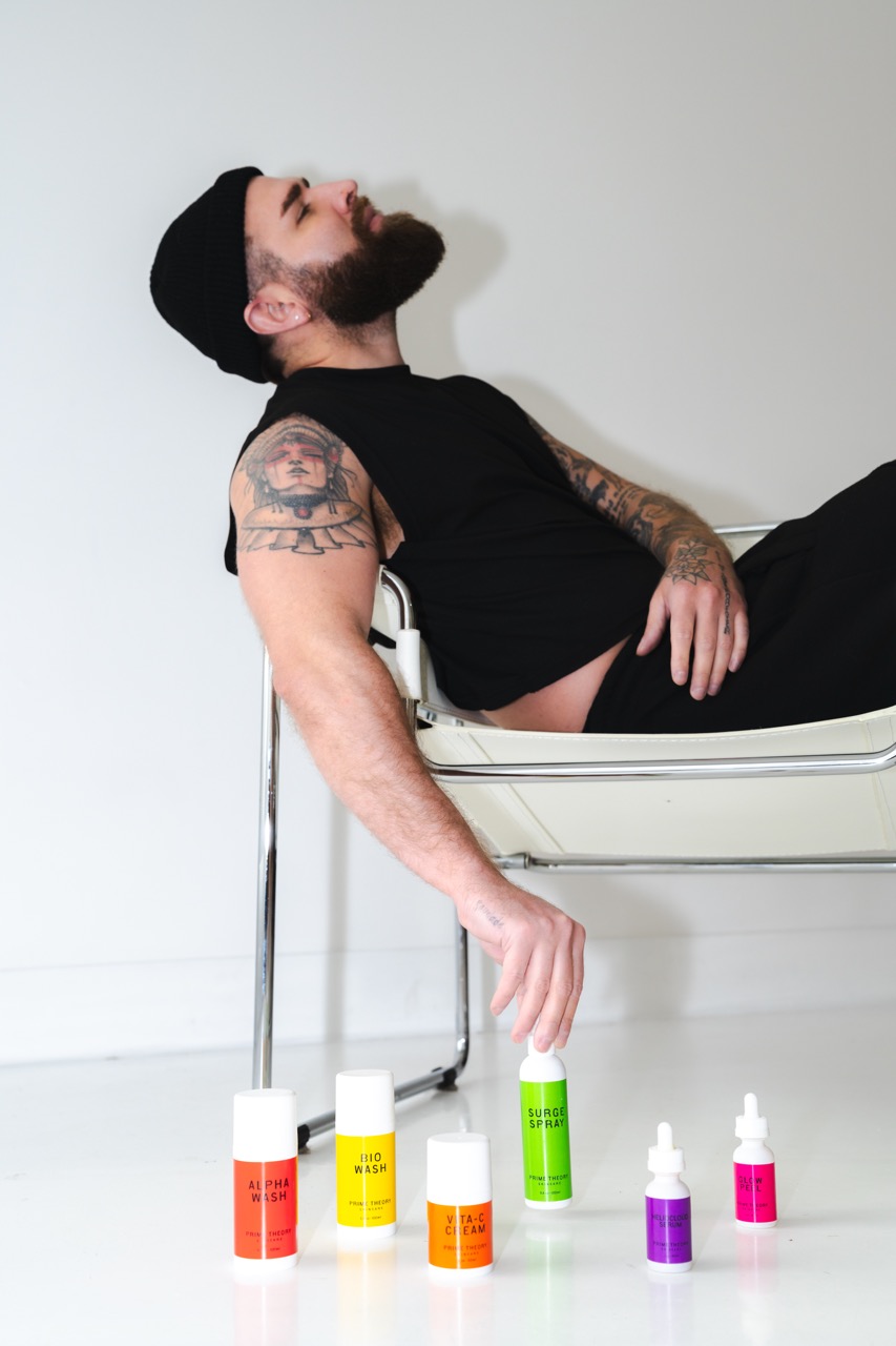
Each formula receives its own personality while still belonging to the same family. The labels are not just colorful decoration - they help clients understand what each product does and where it belongs in the routine.

A bright yellow daily cleanser that feels fresh, clean, and easy to reach for at the beginning of a routine.
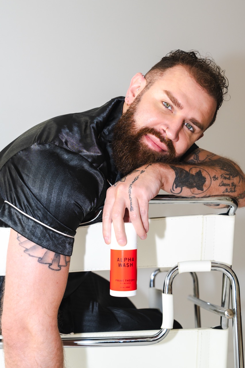
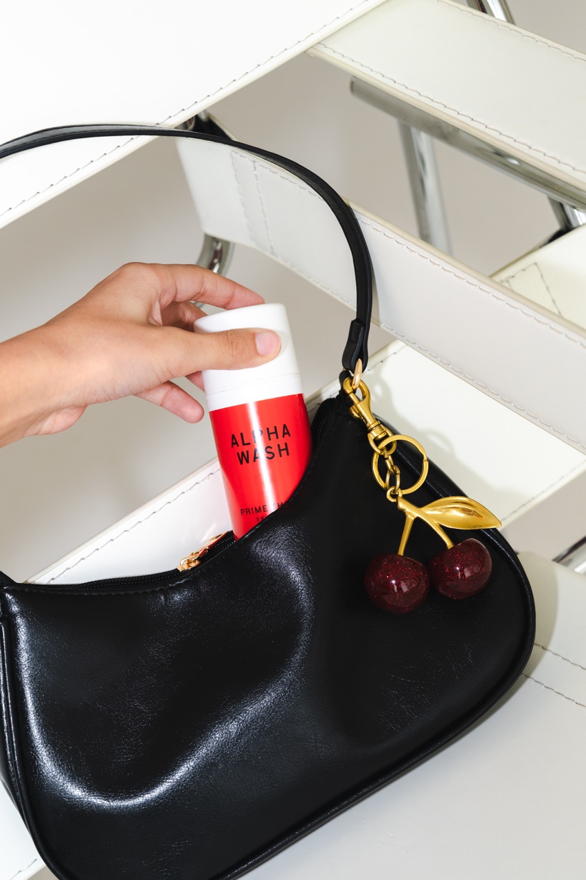
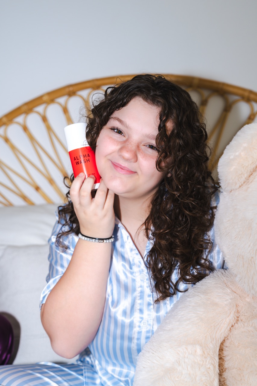
A red anchor product designed to feel confident, direct, and dependable inside the skincare lineup.
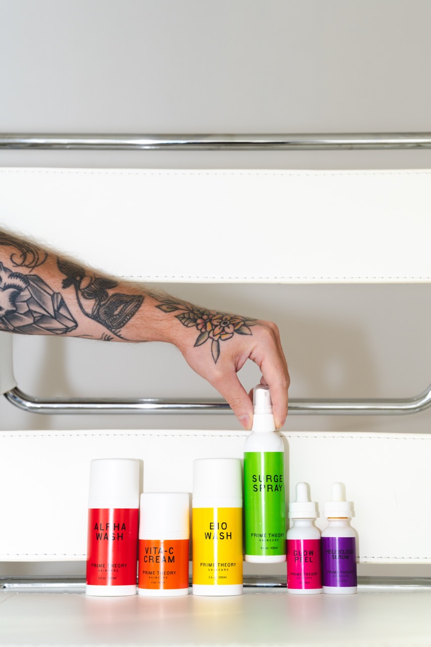
A green hydrating spray that signals refreshment, mobility, and quick relief throughout the day.
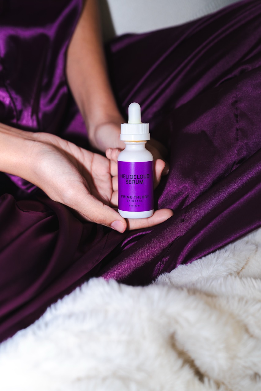
A purple serum with a more atmospheric personality, positioned around transformation and ritual.
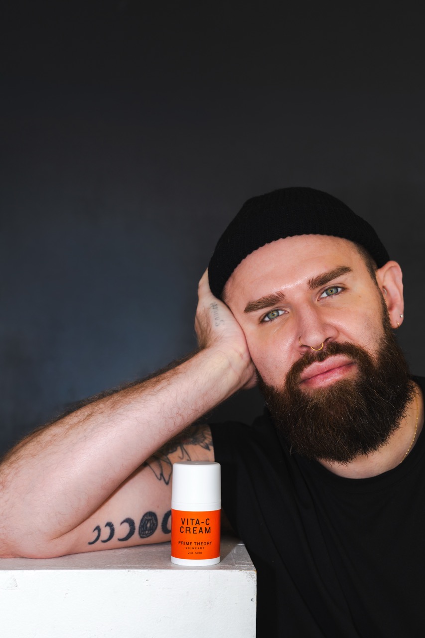
An orange cream that brings warmth, energy, and radiance into the product family.
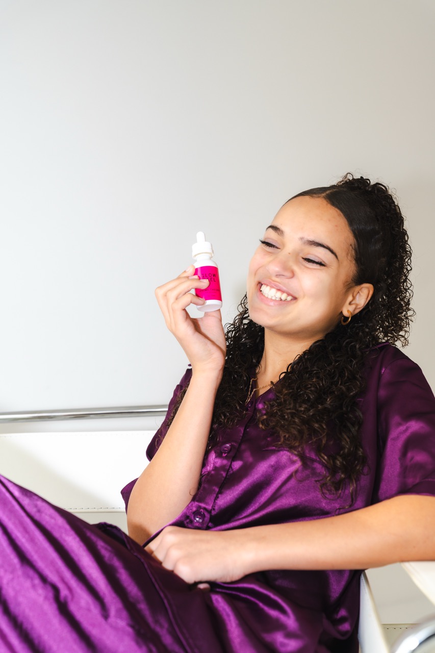
A pink peel designed to feel direct, memorable, and a little more playful without losing credibility.
Photography + Art Direction
The imagery avoids sterile laboratory aesthetics. Products appear in handbags, blankets, bathrooms, bedrooms, treatment spaces, and moments of rest, answering one question: how does this product fit into everyday life?
Messaging
The messaging does not lead with ingredients first. It starts with a problem, a feeling, a benefit, science, and then the routine. The result is educational content that feels conversational and useful.
Results
The final system created a family of products immediately recognizable through color while maintaining a consistent visual language across packaging, photography, campaign imagery, and social content.
Prime Theory extends the Redavfined client experience far beyond the treatment room through ongoing campaigns, product education, lifestyle imagery, and daily routine storytelling.
Packaging, identity, and campaign direction